
Overview:
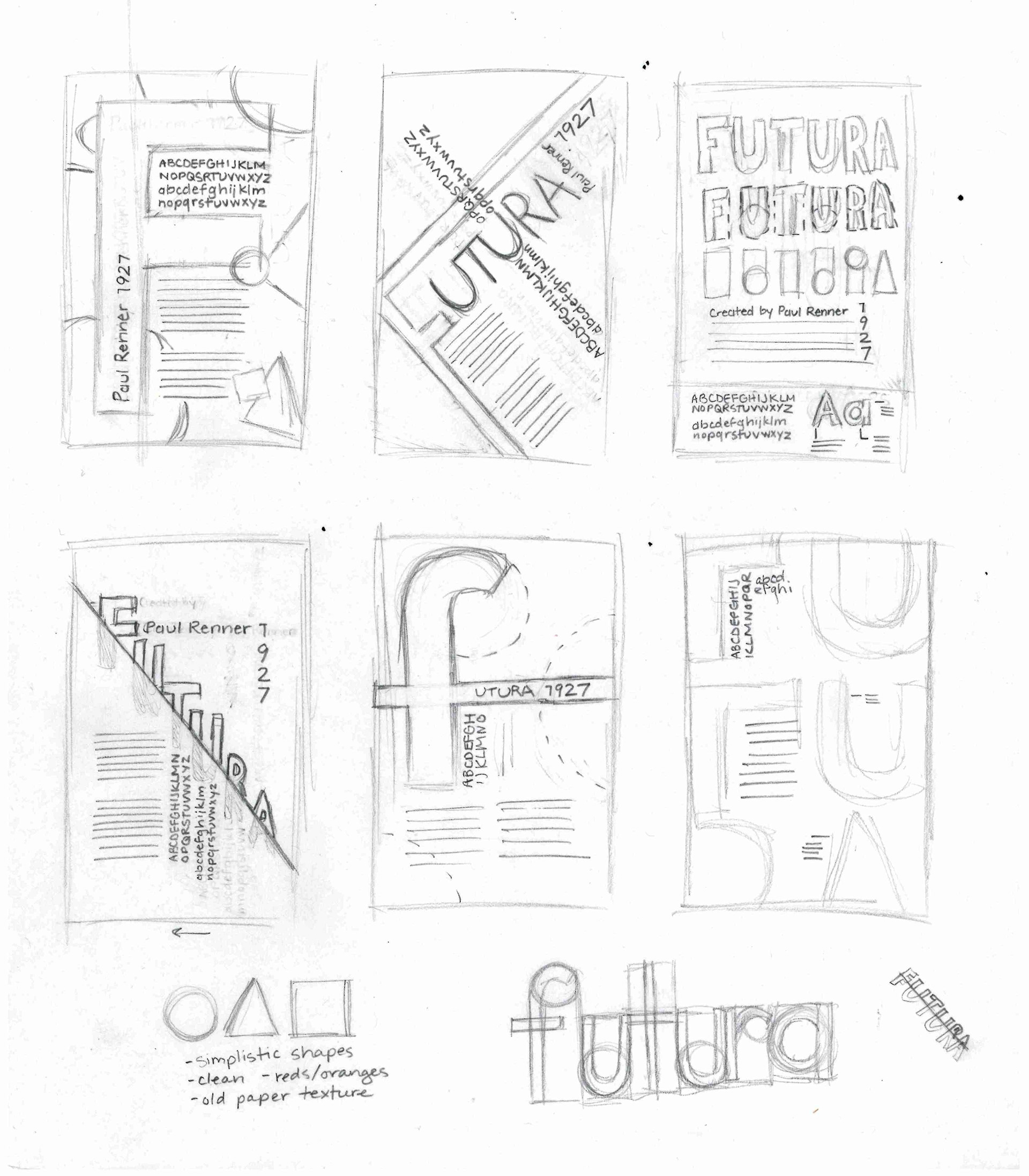
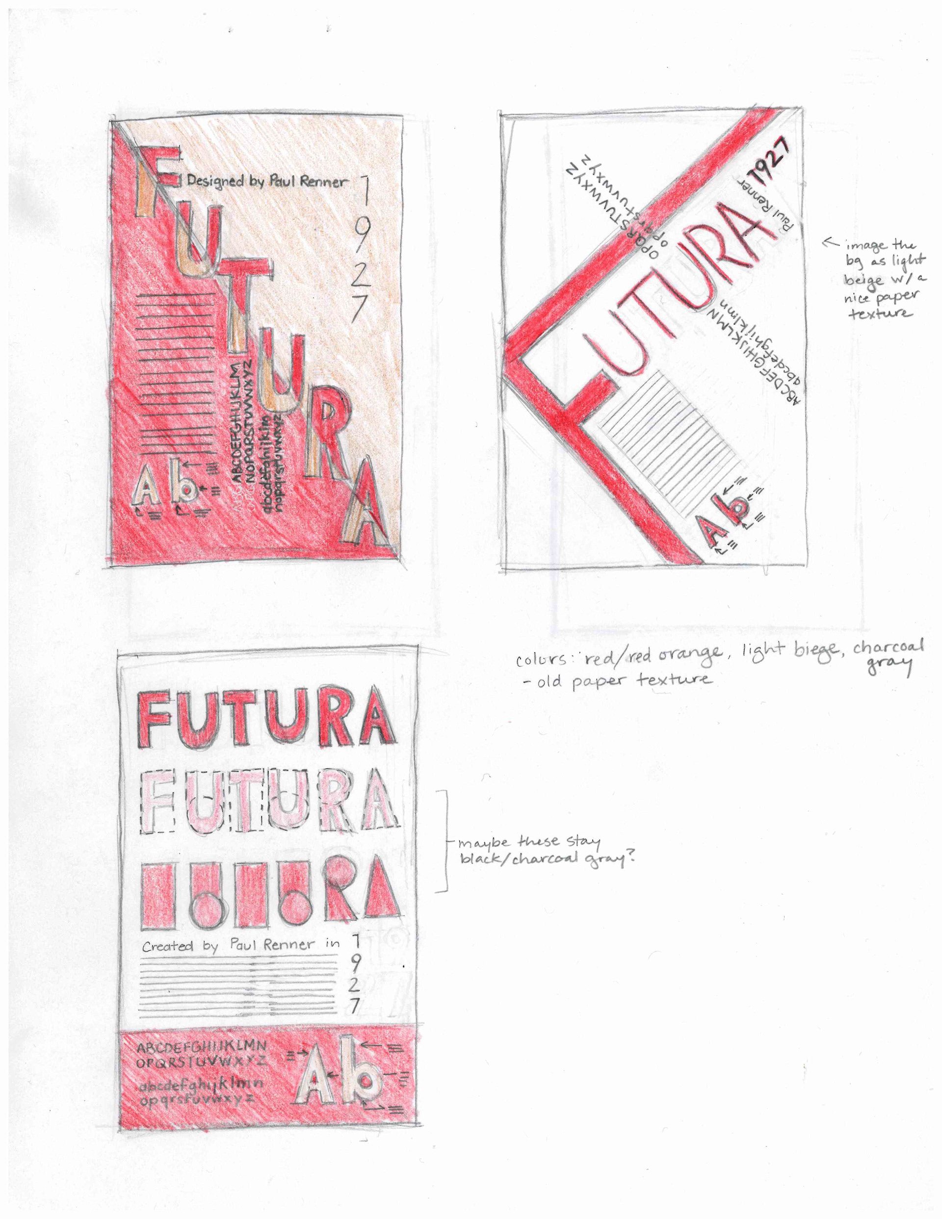
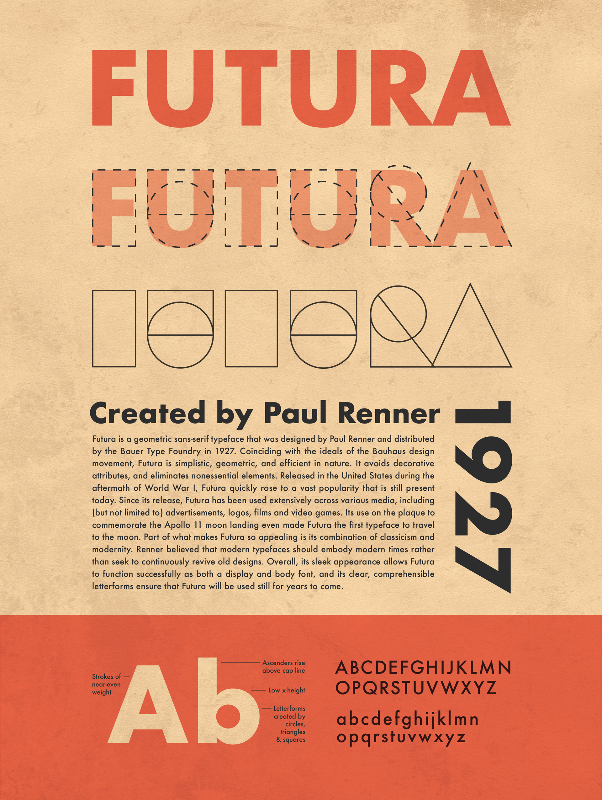
An exploration of the history and application of Paul Renner’s classic 1927 typeface: Futura. My goal for the design of this poster was to imitate Futura’s efficient, geometric letterforms that avoid decorative attributes and nonessential elements. I created a header illustration to depict how the characters of Futura are derived from geometric shapes, and kept the layout clean with a simple grid.